Toast
Cuando queremos mostrar una notificación, podemos usar el componente toast.
Los toast debemos inicializarlos nosotros, además si queremos que automáticamente se oculten, debemos quitar el autohide: false;
<button type="button" class="btn btn-primary" id="liveToastBtn">Show live toast</button>
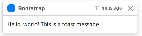
<div class="toast-container position-fixed bottom-0 end-0 p-3">
<div id="liveToast" class="toast" role="alert" aria-live="assertive" aria-atomic="true">
<div class="toast-header">
<img src="..." class="rounded me-2" alt="...">
<strong class="me-auto">Bootstrap</strong>
<small>11 mins ago</small>
<button type="button" class="btn-close" data-bs-dismiss="toast" aria-label="Close"></button>
</div>
<div class="toast-body">
Hello, world! This is a toast message.
</div>
</div>
</div>Para que pueda funcionar, debemos tener el siguiente jS
const toastTrigger = document.getElementById('liveToastBtn')
const toastLiveExample = document.getElementById('liveToast')

if (toastTrigger) {
  const toastBootstrap = bootstrap.Toast.getOrCreateInstance(toastLiveExample)
  toastTrigger.addEventListener('click', () => {
    toastBootstrap.show()
  })
}
Estos toast se pueden personalizar e incluso hacer que se apilen, modificar su posición,